Payscrow
Client
Figma
Services
Web Design, Landing Page, Dashboard
Timeline
2 Weeks
Year
2024
Case Study: PayScrow – B2B Escrow Web & Dashboard Redesign
PayScrow is a secure digital escrow solution that helps businesses and individuals buy, sell, rent, and pay with confidence. My role was to redesign the website and dashboard to improve usability, build trust, and enhance the overall transaction experience for B2B users.
1. Discover – Understanding the Problem
To kick things off, I needed to understand how users interact with escrow services and what challenges they face.
Client Goals:
Rebuild the web interface and user dashboard
Improve onboarding and user trust
Simplify transaction flows (for both parties involved)
Clarify escrow steps (initiation, approval, release, dispute)
User Research:
I interviewed both merchants and service providers who rely on escrow for high-value transactions. The research revealed confusion in the payment flow and poor visibility into transaction status.
Key Insight:
“Users needed clarity on where they are in the escrow process — and confidence that their money is safe at every step.”
2. Ideate – Simplifying Secure Transactions
With clarity on user pain points, I began mapping out better workflows and clearer hierarchy.
User Flow & Wireframes:
I redesigned the core experiences:
Account setup and KYC
Creating and receiving an escrow request
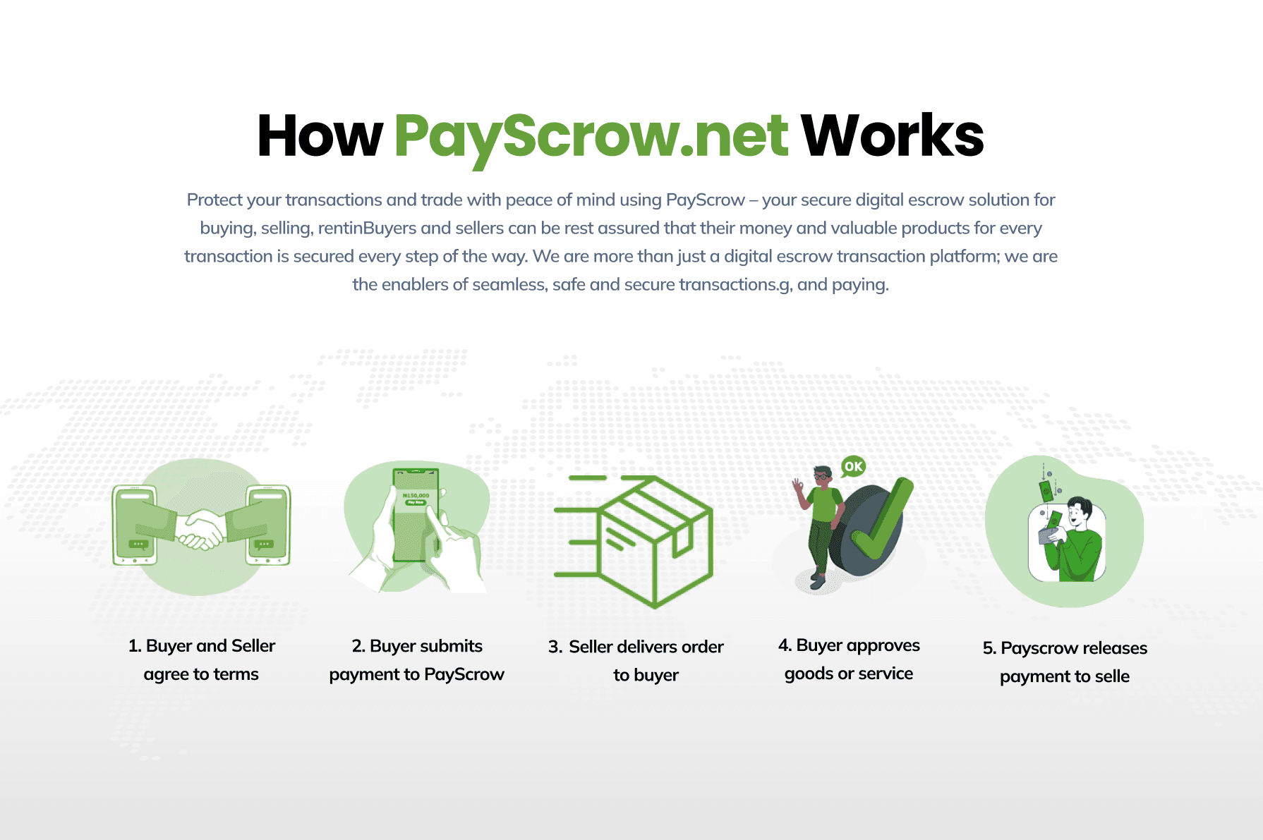
Transaction lifecycle (Pending → Funded → Released → Completed)
Dispute resolution and message thread
Feedback Loop:
I shared early wireframes with the client and real users for validation. Key improvements suggested:
Adding status indicators per transaction
More context at every step (tooltips, progress steps, etc.)
Decision:
I introduced a step-by-step transaction tracker, clean sidebar navigation, and context-specific actions (e.g., “Upload Document”, “Release Funds”).
3. Design – Building Trust Through Clarity
With a stronger structure, I moved into high-fidelity UI design to bring the product to life.
Design Tools:
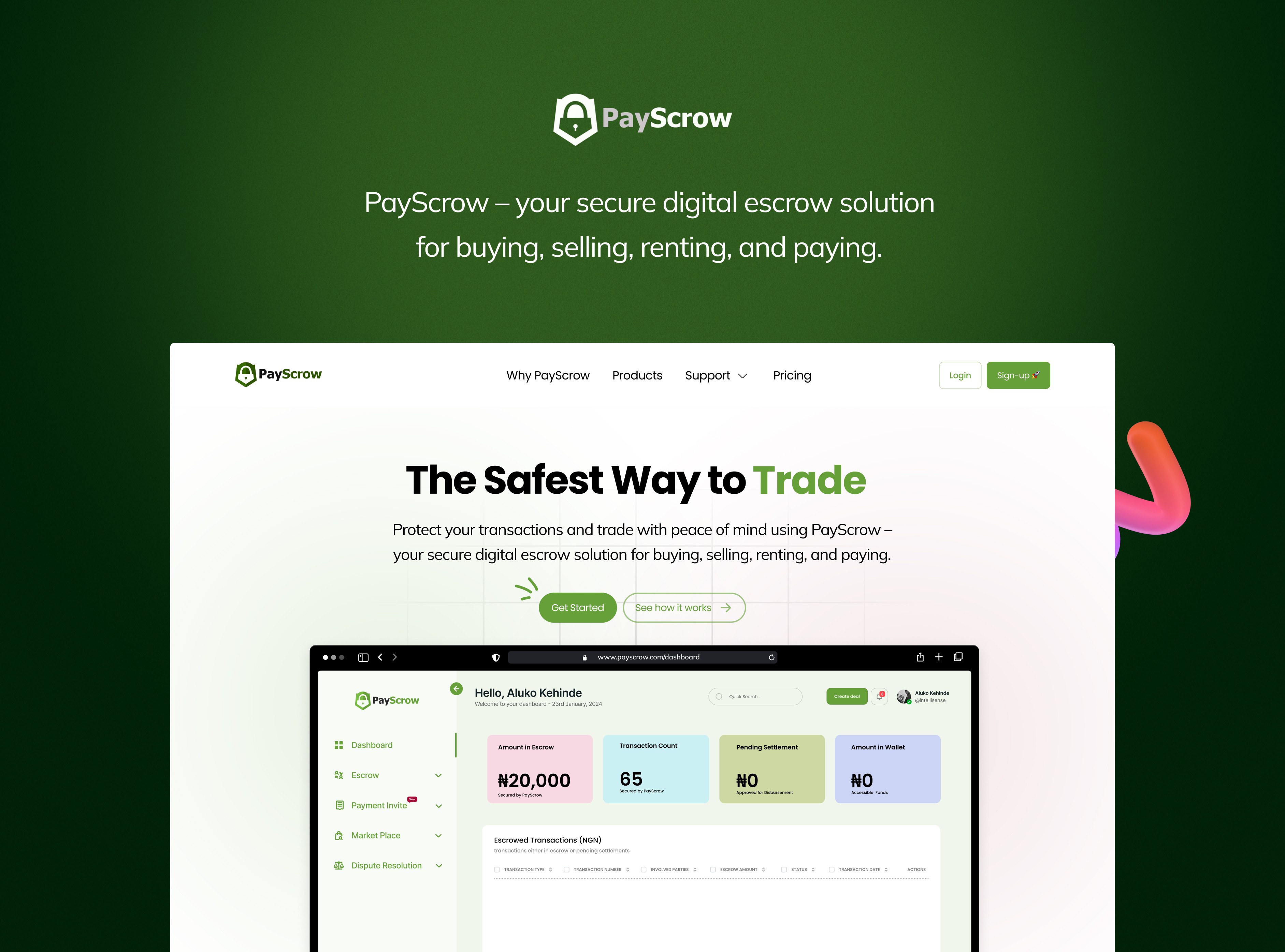
Figma was used to create both the responsive website and the full dashboard interface.
Visual System:
A trust-focused design language with blues, neutrals, and confident typography
Clear visual hierarchy to guide users through complex transactions
Custom icons and progress indicators to support quick scanning
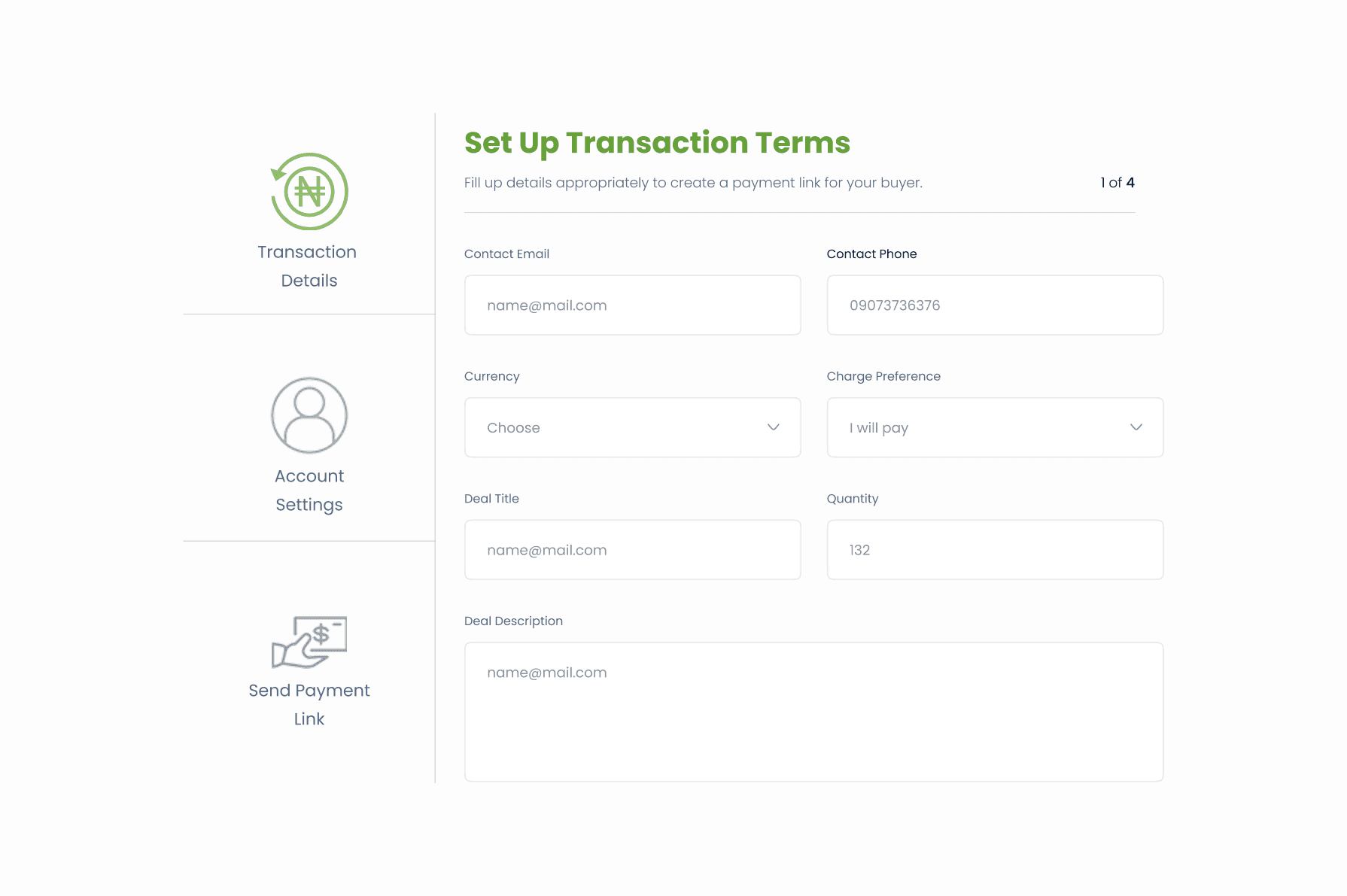
Components Designed:
Escrow Tracker Widget
Dashboard Overview (Active Transactions, Disputes, Upcoming Releases)
Transaction Detail Page
Messaging Center
KYC Verification Flow
Prototype:
A clickable prototype was created to simulate the entire transaction process — from escrow initiation to fund release.
4. Test & Refine – Validating with Real Users
Usability tests were conducted to catch friction points and confusion in the flow.
Usability Testing:
Testers (business users and vendors) were asked to complete key tasks:
Initiate a new escrow
Track an ongoing transaction
Raise a dispute
View payment history
Findings:
Some users weren’t sure what happens after a payment is made
Others struggled with where to upload contracts/invoices
Few missed dispute entry because it was too hidden
Final Refinements:
Added a step-based progress bar with contextual instructions
Introduced smart nudges (e.g., “Waiting for Buyer to Fund”)
Improved dispute entry visibility and messaging flow
5. Deliver – Preparing for a Smooth Handoff
Once approved, I prepared all deliverables for the development team.
Figma files with organized pages and components
Interactive prototype for handoff
UI documentation (spacing, color styles, icon usage)
Visual QA support and responsive breakpoints for desktop/tablet
Conclusion
PayScrow’s redesigned platform now delivers a streamlined and secure escrow experience that’s easy to follow, visually clear, and ready for scale.
Post-redesign results (pilot launch):
2× increase in completed transactions
50% drop in support tickets related to “unclear payment flow”
Faster onboarding time for new users
When it comes to financial UX, clarity builds trust.
And with PayScrow, users now feel more in control — and more confident — with every transaction.